In today’s fast-paced digital landscape, having a responsive website design is no longer optional — it’s essential. Whether you’re running a local business or a global brand, your website serves as your digital storefront. If it doesn’t load properly or look great on all devices, you risk losing potential customers and valuable search engine rankings.
What Is Responsive Website Design?
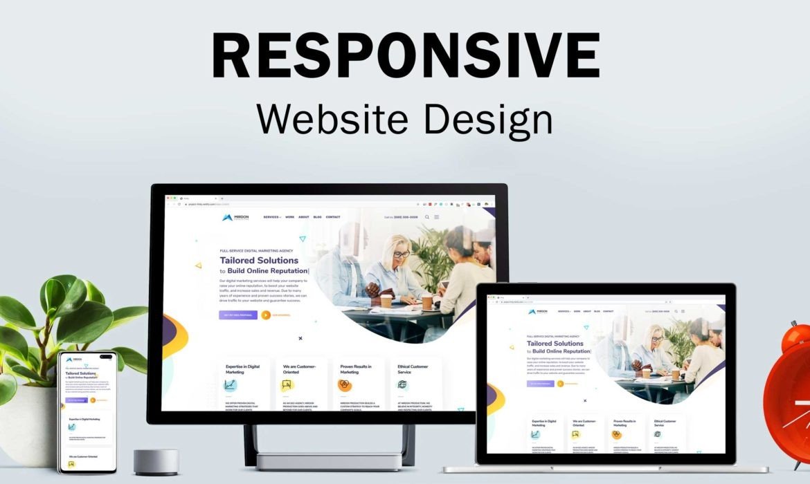
Responsive website design refers to the approach of designing web pages that automatically adjust their layout, images, and content based on the screen size and orientation of the device being used. This means whether a visitor accesses your site from a desktop, tablet, or smartphone, the experience remains seamless and user-friendly.
Key Characteristics of a Responsive Website:
-
Fluid grids and flexible layouts
-
Media queries for adaptive design
-
Optimized navigation and touch elements
-
Fast-loading images and videos
-
Cross-browser and cross-device compatibility
Why Responsive Design Matters
1. Mobile Usage is Dominant
Over 60% of all web traffic now comes from mobile devices. If your website isn’t responsive, it could be frustrating for mobile users, leading to high bounce rates and lost conversions. A mobile-optimized experience ensures your users stay engaged, no matter what device they use.
2. Improves User Experience (UX)
User experience is the cornerstone of website success. Responsive design ensures readability, accessibility, and usability across all platforms. When users can navigate easily, they are more likely to stay longer, explore your content, and take action — whether it’s making a purchase or submitting a contact form.
3. Boosts Search Engine Rankings
Search engines like Google prioritize mobile-friendly websites. In fact, Google uses mobile-first indexing, meaning it primarily considers the mobile version of a site for ranking and indexing. Responsive websites are more likely to perform well in search results, especially when integrated with SEO‑friendly Website Design Services.
4. Faster Page Load Times
Responsive design helps streamline your website’s performance. Pages that load quickly on all devices not only improve user satisfaction but also align with Google’s Core Web Vitals — key performance metrics that directly impact SEO.
5. Cost-Effective and Easy to Maintain
Instead of maintaining separate versions of your site for desktop and mobile, a responsive website simplifies everything. You only need one version to update, which saves time, money, and technical headaches. Plus, a unified approach enhances consistency in branding and messaging.
SEO Benefits of Responsive Website Design
An often-overlooked aspect of responsive design is its impact on search engine optimization. Let’s explore how responsive design supports your SEO goals:
Lower Bounce Rates
If users land on your site and can’t read or interact with it easily, they’ll leave — and quickly. High bounce rates are a red flag for search engines. Responsive sites reduce bounce rates by delivering a smooth experience that encourages users to stay longer and explore more pages.
Improved Dwell Time and Engagement
Responsive websites keep users engaged by making it easy to consume content and navigate between pages. The longer a visitor stays, the more signals you send to search engines that your content is relevant and valuable.
Cleaner Code for Better Crawling
When working with SEO‑friendly Website Design Services, responsive websites are often built with clean, semantic HTML and optimized CSS. This helps search engine crawlers index your pages more effectively, boosting your chances of ranking well.
Consistent URL Structure
Responsive sites use a single URL for both mobile and desktop users. This avoids issues with duplicate content and ensures that link equity is consolidated rather than split across multiple versions of the site.
How SEO‑Friendly Website Design Services Can Help
Partnering with professionals who offer SEO‑friendly Website Design Services ensures your site is built with both users and search engines in mind. Here’s what to expect from a high-quality service:
Mobile-First Design Approach
Experienced designers start with the smallest screen and scale upward. This ensures optimal performance on all devices, especially smartphones and tablets.
Optimized Page Speed
Through image compression, caching, and streamlined code, responsive websites are designed for fast loading — an essential ranking factor.
Structured Data Integration
Adding schema markup to your responsive website helps search engines better understand your content, enhancing your appearance in rich search results.
On-Page SEO Integration
From optimized meta tags and headers to clean URLs and internal linking, SEO‑friendly Website Design Services ensure your website is ready to rank.
Accessibility and Compliance
A responsive, SEO-ready site also considers accessibility standards (such as WCAG) to make sure users with disabilities can access your content.
Conclusion
In the age of smartphones, tablets, and wearable tech, responsive website design is no longer a luxury — it’s a necessity. It’s critical for providing a positive user experience, improving search engine visibility, and ensuring your site performs at its best across all platforms. If you’re planning a new website or thinking of redesigning your existing one, don’t settle for outdated layouts or clunky mobile versions. Instead, invest in SEO‑friendly Website Design Services that prioritize responsiveness, performance, and SEO from the ground up.