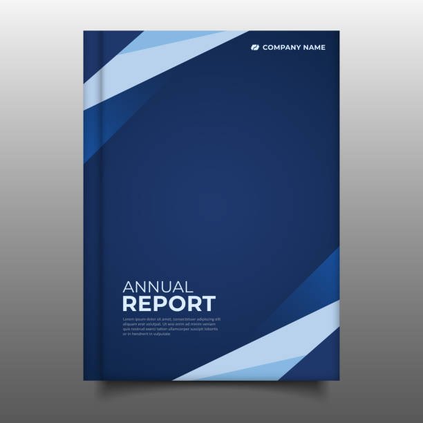
When it comes to telling your business’s story, annual report design is more than just assembling facts and figures. It’s about shaping perception, building trust, and elevating your brand’s visual identity through a polished, strategic presentation of your yearly achievements. At a time when audiences are flooded with content, an intelligently designed annual report doesn’t just inform—it captivates.
Let’s explore why annual report design is a critical part of your business’s communication strategy and how it can turn raw data into a compelling narrative.
Why Annual Report Design Matters
Your annual report is one of the most important documents your business releases each year. It provides stakeholders, investors, customers, and even employees with a snapshot of your performance, goals, and direction.
But a plain, text-heavy report simply won’t cut it anymore. Today’s audiences expect visual appeal, clarity, and engagement. This is where a well-thought-out design becomes essential.
Good annual report design helps you:
-
Enhance credibility with polished, professional layouts
-
Highlight key milestones and achievements effectively
-
Use infographics and visuals to make data digestible
-
Keep stakeholders engaged with a cohesive story
-
Reinforce your brand identity with consistent style elements
Core Elements of Powerful Annual Report Design
To build an effective annual report, a combination of visual communication and strategic storytelling must come together. Here’s what top-tier designs incorporate:
1. Clear Structure and Hierarchy
From the CEO’s message to financial summaries, each section must have a logical flow. Good design uses headers, subheaders, and spacing to guide the reader naturally through the content.
2. Compelling Visuals and Infographics
Charts, graphs, and icons help break up heavy content while making data more understandable. Custom visuals, when aligned with your brand palette, bring energy and clarity to the report.
3. Consistent Branding
From typography to colors and image style, every element should echo your brand’s voice. A seamless visual identity builds recognition and professionalism.
4. Typography that Enhances Readability
Font choice matters. Clean, legible typography ensures long-form content is easy to navigate, especially when reports are viewed on digital devices.
5. Responsive and Accessible Formats
Annual reports are increasingly being consumed digitally. Responsive formats ensure they look great across devices, while accessibility features (like screen-reader compatibility) ensure inclusive communication.
Print vs. Digital: What Works Best?
While traditional print reports still have their place, especially for investor meetings or formal presentations, digital annual reports offer greater flexibility.
Benefits of digital formats:
-
Interactive elements (e.g., animations, clickable graphs)
-
Easy sharing and downloading
-
Integration with multimedia content (video, audio)
-
Analytics tracking for engagement insights
That said, hybrid approaches—offering both formats—often provide the best of both worlds.
Trends in Annual Report Design
Design is constantly evolving. If you want your report to stand out, staying ahead of trends is essential.
Here are key trends shaping 2025 reports:
-
Minimalist Aesthetic: Clean layouts that let content breathe
-
Sustainability Themes: Emphasis on ESG achievements
-
Storytelling Approach: Using narratives to connect numbers with impact
-
Dynamic Graphics: Motion and animated visuals for digital editions
-
Interactivity: Clickable reports that allow users to navigate their interests
Common Mistakes to Avoid
Even the best content can be undermined by design missteps. Watch out for:
-
Over-cluttered pages – Keep layouts simple and focused
-
Inconsistent design – Maintain brand unity throughout
-
Hard-to-read fonts – Prioritize clarity over creativity
-
Ignoring mobile users – Ensure digital reports are mobile-friendly
A strong design team will avoid these pitfalls and help you strike the right balance between creativity and professionalism.
The ROI of Professional Annual Report Design
You may wonder if investing in a well-designed annual report is worth it. Consider this:
-
A strong report can impress investors, making future fundraising easier
-
It enhances brand perception and builds stakeholder trust
-
It helps internal teams feel aligned and motivated by a shared vision
-
It can attract media attention, especially if shared strategically
In short, your annual report is more than a summary—it’s a brand asset.
Final Thoughts
In the world of corporate communications, first impressions count—and last. A poorly designed report can undermine great performance, while a strategically crafted one can elevate your message and showcase your vision.
That’s why partnering with professionals who understand the nuances of design, storytelling, and stakeholder engagement is crucial.
If you’re ready to take your business narrative to the next level, consider collaborating with pepperit—a trusted name in annual report design that blends creativity with clarity, delivering reports that don’t just inform, but inspire.
